I came across a really cool web site called SHOW US YOUR TYPE, which is a project about type and cities. They started the project to provide a creative platform for designers to share their talents and explore cities from a different perspective. Here's the website. http://www.showusyourtype.com .
It seems that they put out an "issue" every so often that exhibits typographic design posters of a specific city. The ones they have on the web site right now are Barcelona, Beirut, Berlin, Cairo, Hong Kong, Istanbul, Kingston, London, Melbourne, Moscow, New York, and Rio de Janeiro. The current city for which they just finished taking submissions (on Nov. 23) is for Tokyo. It seems that anyone can enter, and they provide the exact specifications.
There are many posters for each city, and they are really fun to look through! I'm going to post the ones that are my favorites for each city. These are the ones that caught my eye either because to me they portray the feeling of the particular city, because I love the typography, or because I love other design elements including color, contrast, emphasis, etc. In some cases there were so many great posters that it was REALLY hard to pick a favorite!
Here they are:
BARCELONA, designed by Ana Areias. The decorative typography appeals to me SO much, as do the colors!
BEIRUT, designed by David Gutiérrez - I like the illustrative graphics and colors (and I like tabbouleh!).
BERLIN, designed by Remy Sanchez. The different colored photos and the letters of BERLIN made from the negative space is a cool approach.
CAIRO, designed by Bosco. I LOVE the simplicity and minimalism of this Swiss style poster!
HONG KONG, designed by Law Siu Yin. I love the beautiful colors swirling through the letters, and the flowering blossoms on the tree branches seem very "Hong Kong." It's gorgeous.
ISTANBUL, designed by Eyüp Ugramaz. I like the typeface and the fact that it's all lower case. Also the brightness of the greens and lighter blues have a neon effect against the dark sky, giving it bright, positive energy.
LONDON, designed by Cake. I almost chose another one that had a double-decker bus and simple typography, but I just couldn't get over the amazingly interesting typography in this one.
KINGSTON, designed by Juan Medina. Very Jamaica, at least I think so. The colors and images are great, and the symbols appear to have cultural significance.
MELBOURNE, designed by George Skalides. Again, I love the simplicity of this because of its Swiss style approach and because of the kangaroos!
MOSCOW, designed by Julio Martinez. The delicate letters are shaped (I believe) to look like Russian glass ornaments. Absolutely beautiful.
NEW YORK, designed by Petr Kay. Very hip and striking design. I love the severe contrasts in weight (and obviously black and white), and the three dots for the O is a cool decorative element.
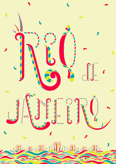
RIO DE JANEIRO, designed by Michaël Carreira. Rio is supposedly a very fun, partying city, and this image is beautifully expressed through everything about this poster!


Here is the page that tells how you can participate. http://www.showusyourtype.com/participate.php Too bad the deadline for TOKYO has passed, but I'm sure they will open it up soon for another city! It's a fantastic project! I would love to try to design one for the next city, whatever it will be! Ciao!


No comments:
Post a Comment