Sunday, September 29, 2013

WRINKLED BILLBOARD

Who would think it would be a good idea to make a billboard look like crumpled paper? In this case, I think it's pretty brilliant.


Hada Cosmetic Medicine is a local business in Downtown Champaign. They specialize in skin treatments to restore a youthful appearance (chemical peels, botox, facials, laser vein treatment, waxing, and more).

Youth/youthful appearance is so valued in this society. Many young people (and I'm going to say all of this applies primarily to women) are taking preventative steps now to avoid wrinkles and skin damage later. Older women are doing things to look as young as they can. This is BIG BUSINESS!

What's probably the number one skin "problem" that women feel they have or want to avoid? Wrinkles.

I had to take note of this billboard from an advertising standpoint. I think it's designed so well. The wrinkles on the left side catch our attention and as we read the word WRINKLE our eyes move to the right to REMOVER, and right below, Hada Cosmetic Medicine logo along with its easy-to-remember website. This can all be absorbed by our brains in a matter of seconds, which is what billboards need to do to be effective. Simple, clear message, good hierarchy, very readable serif font, easy website... it's perfect. And, by the way, I really like their wordmark. It's so elegant.

Does it appeal to me as a woman (of a certain age)? Well, I suppose it does. However, while I've had a couple of facials in my life, I don't plan to spend a lot of money (and I assume it's expensive) to have procedures done that will reduce my wrinkles. Mainly I stay out of the sun, I don't smoke (did you know that smoking has a dramatic effect on your skin?), I eat pretty well, I moisturize and wear sunscreen, and I use gentle, natural facial products. Ask me again in 10 years. Maybe I'll be a Hada client by then. :)

Friday, September 20, 2013

STRUWWELPETER

Looking around one's home can be just as interesting as being out in the community when it comes to interesting graphic design in the form of books, book covers, CD covers, art, and so on. 


When I was little I was intrigued by STRUWWELPETER by Heinrich Hoffman, a German book (this was an English translation), which is a rather gruesome collection of rhyming cautionary stories, the message of which is that if you don't behave properly, the consequences will be harsh, to say the least!  The illustrations alone are extremely chilling. My parents had bought a copy in the 1950s; the original having been published in 1845. There have been over 400 different editions, and it has been translated into many different languages. Notice the differences in the book covers, the one on the left from 1995 and the other from a lot earlier (but there is no publication date in the book!). Actually the main differences are in the type, not the illustration.

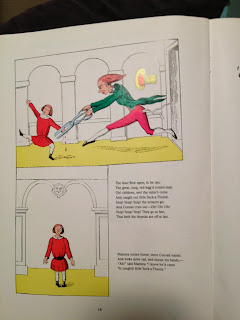
One of the stories is called, "The Story of Little Suck-a-Thumb." Conrad's mother leaves him alone and warns him that if he sucks his thumb while she's away, the tailor will come with giant scissors and cuts off his thumbs, as he does to all little boys who suck their thumbs. "...and cuts their thumbs clean off, --and then, you know, they never grow again.". Conrad doesn't heed her warning and sucks his thumb; sure enough, the tailor comes and cuts both of them off! When his mother returns, she basically says: I told you so.  Yikes!!!
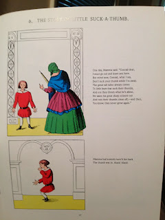

The illustrations on the second page are rather horrifying! Well, maybe not by today's standards considering all that children are exposed to, but still! It's so graphic, with the thumb right in the scissors and the drops of blood falling down! I don't remember being frightened by this as a kid, though. As I said, I was intrigued. It left quite an impression on me, however, and as an adult I have collected a few different editions of Struwwelpeter. The main thing is that the story can pretty much be gleaned by looking at the illustrations alone.

One other example is "The Dreadful Story About Harriet and the Matches" in which Harriet is left alone with her two cats who try to warn her about playing with matches. Of course she doesn't take their advice and ends up catching on fire, and her cats scream and cry as she burns to death, crying a pond of tears next to her shoes and pile of smoldering ashes!!! Again, the illustrations clearly tell the story, even if you don't read the text. So graphic!

(I do tend to be attracted to the bizarre and macabre when it comes to books and movies.)

Just one observation about the text - the older edition's print is not as readable; the letters and the lines are rather crowded. I tried to figure out the font using identifont.com, and I answered 25 questions about letter features; the font is something close to Cushing or perhaps a Caslon font, but I couldn't get the exact one figured out. I had better luck in identifying the font in the newer edition using identifont; it is printed in Weidemann! I was excited that the font identifier actually worked! In any case, the font is very readable, comfortable, has enough space.

The newer book does have provide some interesting information in the afterword and on the back cover:  The book was an immediate success in Germany and became famous internationally, and it has become "widely recognized as one of the most popular and influential children's books ever written."

The illustrations were initially lithographed. "Later they were engraved on wood and electroplated; the hand coloring, done with stencils, became a fairly important local industry." This edition reprinted the color plates that came from an early German edition.

Regarding any controversy, it is stated that "Many educators, from the book's earliest days, have had ideological objections to the violence of the action and the drastic fates of the disobedient children, but young readers and listeners over the decades have seen the humor in the impossibly exaggerated situations, and have endorsed Hoffmann's pedagogic views by taking the book to their hearts."

This was a fun little book study for me. :)


sources:

Struwwelpeter in English Translation, Heinrich Hoffmann, Dover Publications, Inc., New York, 1995

Struwwelpeter: Merry Stories and Funny Pictures, Heinrich Hoffman, The Grolier Society, Inc., New York, date of publication unknown



Sunday, September 15, 2013

My fascination with playing cards (and other card decks for that matter)


In reading the Meggs text, the short section about playing cards and how they came to be reminded me of my own fascination with cards and my little collection of card decks which I decided to dig out and just enjoy looking through them all. I have playing cards from other countries that make absolutely no sense to me, but they are beautiful and create a sense of wonder in me about how the games are played. I also have decks of cards of things like Tibetan art and Buddhist deities. Here I thought I would focus on traditional playing cards with which we're all familiar. The suits - diamonds, hearts, clubs, spades (it was interesting to read in the text where these symbols actually came from) are interesting in themselves. The number of uses of cards (not just for card games - remember building card houses, anyone?) is vast, and I am by no means a card player. I know a few games and have played my share of Rummy, Crazy Eights, Hearts, and various Poker games, but what I really enjoy is just looking at them, feeling them, shuffling them. There are decks for any enthusiast; for example, this German deck of cards, each with a different beautifully illustrated cat, is obviously for the cat lover. The cards don't have the actual number of diamonds, hearts, etc., that correspond with the number. I guess there's no room because of the cats.  Love it. And, there's a huge difference between decks with regard to the shape of the symbols and the typestyle of the number and letters. 


So I hear that Shrinky-Dinks have made a comeback these days, but they originated in the 1970s when I was a kid. I LOVED them! This tiny matchbook card deck was something I made when I was a kid. I traced the joker but made the teeny tiny cards freehand. I don't think there are 52 cards left, but I'm glad I held on to this little piece of my past. The fascination began way, way back. :)


The third example (it was difficult to pick just three) is of a deck someone brought me from Australia. The artwork was designed by an aboriginal artist, and I absolutely love that style and actually try to emulate it in my own painting. The unique attribute about this deck is the perfectly square corners. I don't think I've ever seen a deck with that. The main beauty of the cards is on the backside - but the design is identical on each one. There's a ghost image on each of the card fronts as well. The suit shapes are slightly different and somehow more elegant than what I'm used to seeing. Perhaps something many wouldn't notice. That's what this is about, though, right? Really paying attention?


I wish I could include images of all of my card decks, but that would be ridiculous... My realization: I never really stopped to consider the graphic design of playing cards; I just have always been very fond of them and get excited when I see something that is out of the ordinary or especially beautiful or quirky or interesting in some way. :)

Friday, September 6, 2013

THE PERFECT HANDY DANDY SIGN... How COOL is this?!

I actually snapped this photo just days before seeing the movie "The Sign Painters" this week. This hand-painted sign sits in front of the locally-owned thrift shop called "Dandelion" in downtown Champaign when the store is open (obviously). Dandelion is filled with all kinds of clothes, jewelry, accessories, boxes, and other items. Much of merchandise is comprised of resale items but they also carry new products. They are "vintage/trendy," I guess you would say. I have always enjoyed shopping there for myself and for gifts, or just for browsing around. There is a certain happy mood, and the music played varies but is always something I find enjoyable. It's perfect for retail therapy. :) 

After seeing the movie, I have been thinking about hand-painted signs, and I remembered that I had taken this picture. I find it to be so appealing, and I'm glad it is weather-worn but hope they don't replace it with something new/different. It totally fits the store. I love the image of the dandelion, and the shapes that make up the flower look like they could be letters, but they aren't. The leaves make it most clear that the flower is indeed a dandelion. The letters in "Open" are sans-serif, very plain, and not perfect in their consistency in stroke width or even height, at least that's how it appears to me. It looks old. It looks bright and happy. The large arrow points into the store. You can see it from far away. The plain black on bright yellow catches the eye. It lures you in! The wood and paint are cracking and may even be rotting a little at the bottom. You can see the nail or screw holes. It's likely been repainted more than once. I just think it's THE perfect sign for the store!  Next time I'm there, I'm going to ask the owner who designed/made the sign. Maybe it's two different people. Anyway, I love it in its perfect imperfection.

And PS, I had to go back through this blog entry and take out the extra spaces I left after each period. That's going to take some adjustment!

Monday, September 2, 2013

Continuity between Store Logo and Open sign - OOOOOOOOOOh.... pretty cool.


Continuity is nicely illustrated on this downtown storefront window.  Circles is a high-end, trendy, women's clothing and jewelry boutique.  I find the logo attractive and appealing.  It's inviting!  I think it's a great logo.  It's simple, elegant, and a tad clever.  Several fonts are used, and I decided to try to identify them using fonts.com (the feature that allows you to answer a series of questions about the letters in order to try to identify the font).  The lettering in CIRCLES seems perhaps to have been designed specifically for the store, or maybe not.  In attempting to figure out the font, using font.com, the closest I could find was a font called Eaglefeather, but that's not it.  The other words on the CIRCLES appear to be in Futura.  I can't find a font for the PEN in OPEN.  It's kind of fun to use these websites to try to identify fonts, though.  It is bothering me, however, that I can't find anything that resembles the font used in CIRCLES, especially with regard to the shapes of the Cs and the E.  Anyway, back to continuity.  This store is a very classy store, expensive, interesting unique items, and so on.  They did a fantastic job making the signage really fit the feel of the store, and I'm sure it pulls people in.  I wish I could afford to shop there!

Sunday, September 1, 2013

Dissection and commentary of a nail polish ad poster. Who me?

I was shopping at Walgreens and came across this advertisement for Essie brand nail polish.  Honestly I've never heard of Essie before, but this ad caught my eye.

First, I found it interesting that it was black and gray, not colorful as one might expect a nail polish ad to be!  I think it's pretty effective as a way to grab someone and make them look closer.  I did.

So what is it about this poster that intrigued me?  First, the layout is pleasing to my eye.  The paintbrush at the top dripping down onto a belt is an odd image, but it drew my attention to the focus area of the poster.  I wondered, "why is there a belt on the bottle?  Why is there paint dripping onto it?"  So I moved closer.  "Ah, it's a nail polish ad.  What brand?"  I saw "essie" in four places on the poster:  the quote, on the bottle at the bottom, lightly etched vertically on the right side, and in the signature on the right.

Then, "Why is there a belt?" I took a closer look.  Clever.  The smaller text in the quote says, "...have style all cinched up."  Something about the dripping nail polish, especially in the dark color, reminded me of dripping chocolate.  Hmm.  I wonder if that is intentional.  I'm a dark chocolate lover, myself.  It's like a combination of elements that draw women in, perhaps?  A cinched belt, making one think of "skinny," something like dripping chocolate, the words "nail art," all appeal to many women, I think.  By the way, the quote says, "I'm essie and my nail art looks have style all cinched up."  This gives it a personal touch.

The text is easy to read, but you do have to move closer.  The nail polish bottles are below the poster, so you go closer to the poster, you are drawn to look at the colors of the polish.

Was I tempted to buy any?  Not really.  But I don't paint my fingernails and I get my pedicures done at World Nail Spa, so... Why was I looking there?  I really don't know!  What I do know is that the ad drew me in.  If I were someone who was interested in buying nail polish, I would probably do the next logical thing... check the price!

I do like the poster.  I also find the logo appealing.  I think the graphic artist who designed it must be very proud of him/herself. :)